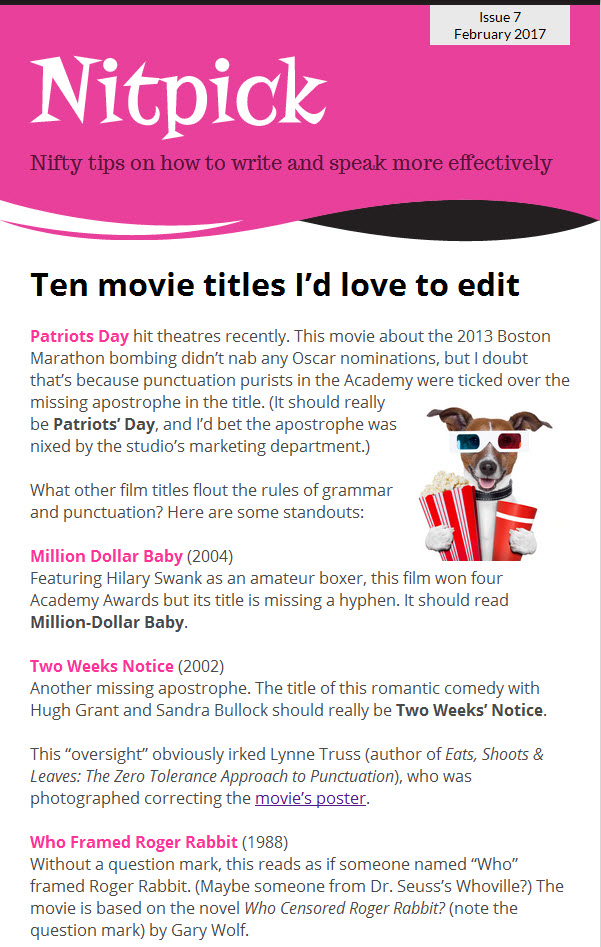
Pesky questions pop up when writing about the pandemic
Have you been writing a lot about COVID-19? Perhaps you’ve drafted safety protocols for employees or supportive newsletters for clients.

If you’re like me, writing during the pandemic raises some pesky editing questions: Should I put quotation marks around the new normal? and How should I refer to those plastic partitions between workstations?
It’s small stuff, for sure, but getting it right and being consistent in your messaging can enhance your credibility with readers.
Here, then, are answers to questions that often pop up when writing about COVID-19:
Which is correct: COVID-19 or Covid-19?
Both are. The Globe and Mail uses COVID-19 whereas The New York Times opts for Covid-19, for instance. It’s a style decision. The important thing is to be consistent in how you write the acronym. For Twitter hashtags, drop the hyphen (#COVID19, for example). Incidentally, the “CO” in COVID stands for “corona,” the “VI” for “virus” and the “D” for disease.
Do I need to use “the” before coronavirus as in “the effects of the coronavirus”?
Yes, but The Canadian Press’s online stylebook discourages using “coronavirus” in isolation. “[Coronavirus] actually refers to a family of viruses of which the current novel strain is just one,” says the book’s editor. CP style is “novel coronavirus,” which requires the article “the” as in “the effects of the novel coronavirus.”
Should I capitalize or put quotation marks around the new normal?
Neither is necessary, unless you’re quoting someone saying the phrase, in which case put it within quotation marks. Better, refrain from using the term, which is about as tired as the words “unprecedented” and “pivot” these days.
Which is correct: practice physical distancing or practise physical distancing?
Both. It depends on your audience. If you’re writing for Canadians, use “practise” because it’s a verb. For U.S. readers, use “practice.” But if you’re using the word as a noun or adjective for Canadians or Americans, use “practice.”
Is plexiglass a proper name?
Plexiglas® is a registered trademark and it should be written as such (note the single “s”). Alternatively, use the generic “acrylic-sheet barriers” when referring to these workstation shields.
Should I use “the” before the initials of the World Health Organization?
Yes, in most cases. But if you’re using WHO as an adjective as in “health officials are following WHO policies,” the article “the” isn’t needed. Says the editor of The Canadian Press’s online stylebook: “When in doubt, spell it out to see if it makes sense.”
What writing questions have pestered you during the pandemic? Tell me about them in an email.
Photo: (c) Can Stock Photo/pedrosala